Pantone Collective Designs Abdul Halder Flagship Store

Fashion designer Abdul Hader’s new retail space is swathed in rich Sacramento green, while materials like brass and velvet and a series of graceful arches and portals add a sense of luxury. We spoke with principal architect Tanya Chutani to find out more about her approach and why she selected just one shade of green to characterise the space

Design Anthology: Can you tell us a bit Pantone Collective and the work you do?
Tanya Chutani: Pantone Collective is an architecture and interior design studio with retail, hospitality and commercial projects New Delhi & Mumbai. The word ‘Pantone’ refers to the colours and art that we draw a lot of our inspiration from, and we always aim to create a colourful balance between art and design by treating spaces like our canvas. As a studio, our design approach centres on using one primary colour alongside different contrasting elements, and we also create bespoke furniture for each project.
How did you come to work with Abdul Halder?
A very good friend of mine is the brand manager for Abdul Halder, and they approached me for this project as they liked my previous interior projects and how Pantone Collective combines art and colour in spaces. They really appreciate how we use single colours and play with different forms.
What was the project brief?
The flagship store needed to have a luxury brand identity with a strong colour palette and contrasting elements to depict the elegance and richness of Abdul Halder’s creations. The focus was also to create a specific design language for the designer’s upcoming stores in Dubai, London and New York.
Where is the store and what’s unique about the location?
The store is on Mehrauli-Gurgaon road in New Delhi, in an area known for art galleries and decor and fashion stores. Whether you’re an art connoisseur, looking to decorate your space or shop designer couture, you can find it all here.
How did you approach the project and what design references did you try to incorporate into the space?
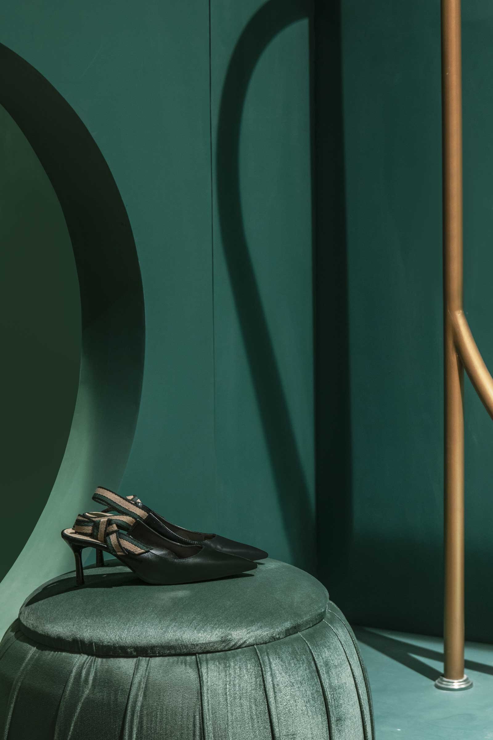
The project centres on a combination of different elements and contrasting colours and materials. I designed the 100-square-metre space to have an expansive open-plan layout, with arches that define various spaces while maintaining a sense of fluidity. We aimed to create an art gallery-like experience by using a combination of forms (the arches, vaults and round portholes), a rich colour palette and various lighting techniques.
What inspired the colour palette, and specifically the use of Sacramento green?
Halder’s more traditional designs incorporate many luxe elements, and we wanted to reference this luxury aspect in the interior design while also creating that gallery experience. We selected the rich Sacramento green to create a dark and calm environment, with lighting chosen to emphasise the display areas. Halder’s couture wear features a lot of bright tones and Sacramento green is a perfect backdrop to highlight the items. We wanted to use a bold colour that suits the label’s brand DNA and works well across different seasons and geographic locations. The process of selecting a colour involved many discussions with the designer and careful examination of his fabric collection & look books.
What about the material choices?
The shade of deep green features throughout the space and we incorporated antique brass finishes to create a sense of contrast. Since we were working with a limited budget, we aimed to use simple materials that still create a sense of luxury thanks to a play of forms, geometry and colour. All the display units were customised in stainless steel with an antique finish, while charcoal terrazzo tiles add a dramatic contrast to the space. The extensive use of tinted mirrors makes the store look big and spacious and highlights the display areas. We used lighting to emphasise various areas and materials, and flexible LED profiles play a major role in highlighting the main central vault and guiding customers through the aisles.
Do you have a favourite element or design detail in this project?
The project is one of my favourites so far, as the interior design really centres on a single colour. The Sacramento green successfully became a canvas for the vibrant couture collection. I still remember the feeling that the client and I had seeing the space come together. It was a delightful experience and team Pantone is really proud of this outcome.
Images / Nivedita Gupta