Homme Haus by Studio Nishita Kamdar

Architect Nishita Kamdar and her multidisciplinary team created this take on small, affordable homes in Mumbai. In this bachelor pad, glass partitions replace solid walls, and materials and colours are repeated to create continuity — all with the intention of maximising the sense of spaciousness. Here the architect shares how she and her team used a four-pronged approach that involved intelligent design strategies and pared-back design elements
Design Anthology: You describe the project as your ‘take on small, affordable homes in Mumbai’. How would you describe this ‘take’ — what is your approach?
Nishita Kamdar: We live in a time when spaces are getting smaller, but expectations are getting much larger. There’s this constant battle between reality and expectations. Amidst this stands the architect, whose role is to try and bridge this gap with design, which is the compromise and subsequent harmony one reaches between thoughts and execution. What makes a good designer is the ability to realise thoughts and ideas in practical and tangible results. I think designing for smaller spaces is a far bigger challenge than designing large spaces or projects that have high budgets, as one needs to be so conscious and calculating about every move, since in a small space every move counts. It’s all about intelligent design.
Would you say you’re observing an increase in demand for such spaces in the city? Are small homes in high-rise buildings typical of city living in Mumbai?
Mumbai’s ever-growing middle class lives in mass-produced apartments of various shapes and sizes, ranging from around 40 to 130 square metres, generally with two to three bedrooms. In a city of over 23 million people, space is understandably at a premium in Mumbai, and I think it’s safe to say sometimes even more so than in New York! There’s a huge influx of people into the city and thus the property market has recently gone through a massive boom; towering apartment building and multi-dwelling complexes are popping up all over the city and especially in the suburbs. The cost of living and buying a home in Mumbai is very high, but being the financial capital, it’s the preferred city to live in. Small homes are thus becoming far more common.
Who was the client for Homme Haus and what brief did they give you?
The client is a single father in his late 30’s who works at one of Mumbai’s leading media companies. The brief was simple — the space had to be his pad, where he could unwind, rest, entertain large groups of friends, but also be a comfortable space for his eight-year-old daughter to grow up in.
What are some key considerations and solutions you incorporated into the design?
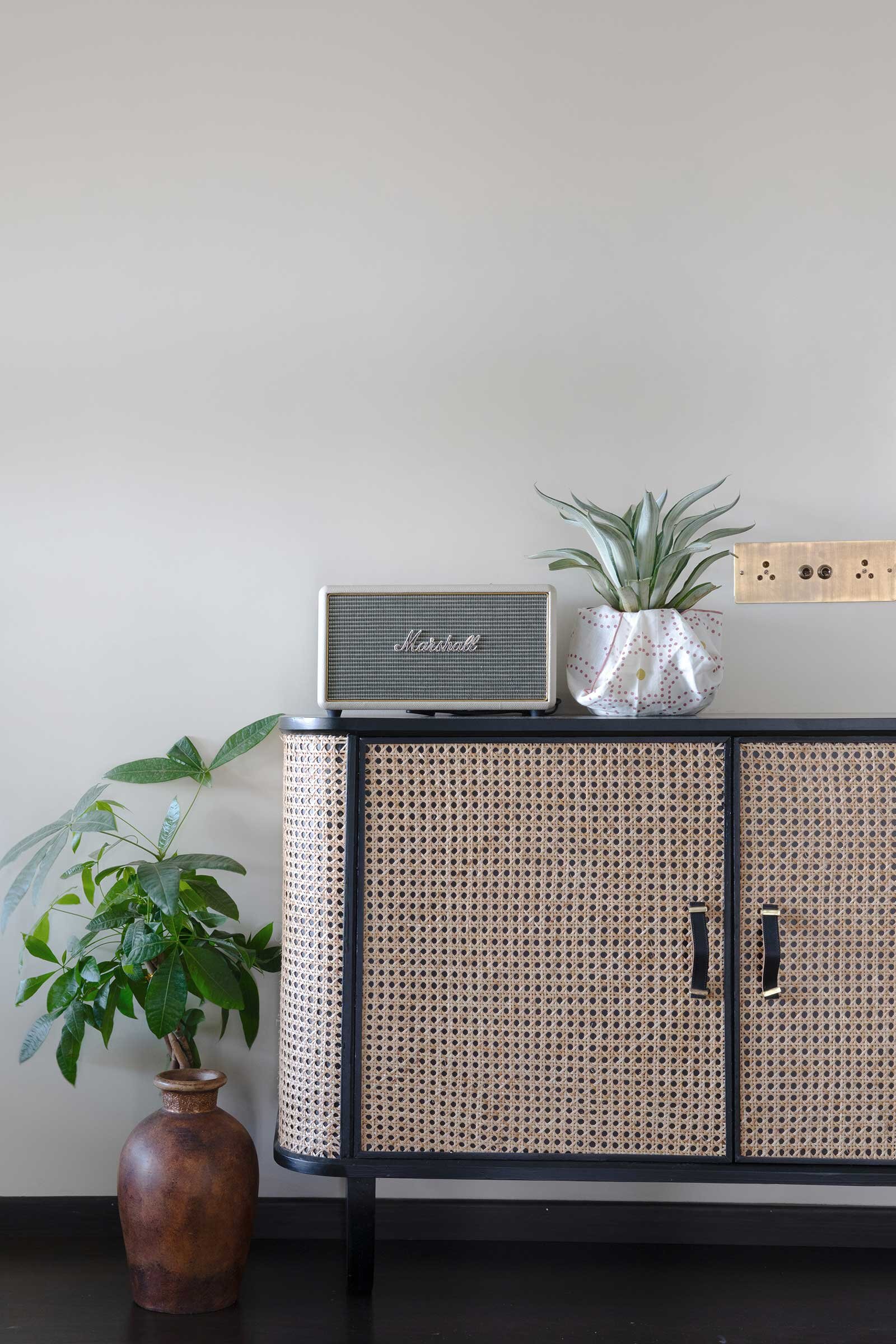
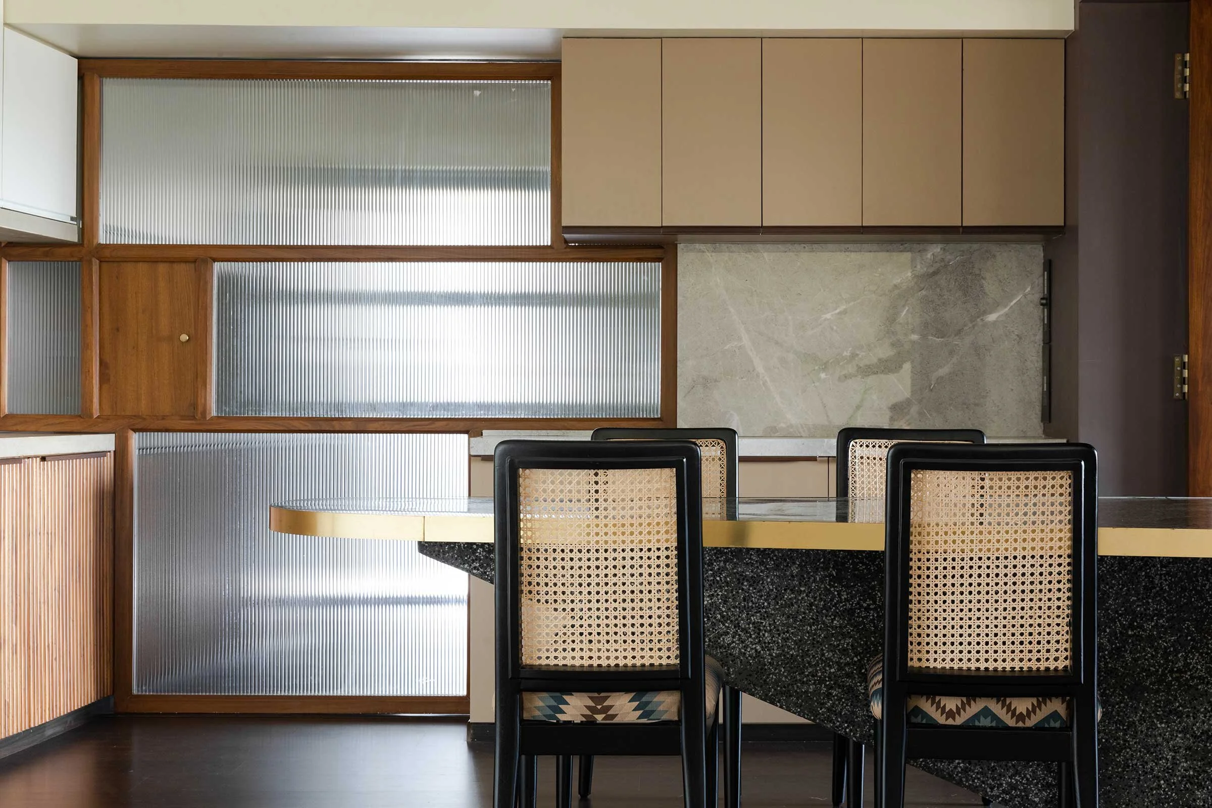
The main design elements in this project are the attention to space and transitions, and the use of colours and space to create different moods. The key design feature of the home is the ease of transition into each space. We purposefully blurred the lines between the common spaces to make the home appear much larger than it actually is. The question was how to intelligently design a space so that it looks bigger than it is, and create value for money for the client. Every penny we spent had to count towards giving the client the home we’d designed for him.
What challenges and opportunities did the home’s size present for your team? How did you overcome any size-related challenges?
We follow a four-point rule that we always stick to when designing small spaces or low-budget projects: ‘smart, seamless, same, stop’.
The furniture should be smart and functional, and the space should be flexible and appear larger. To achieve this here, we started by stripping solid brick walls and replacing them with more open, transparent glass partitions, which can be opened up and are more fluid than fully cordoned off rooms. This gives the illusion of space since one can move through areas seamlessly. The next step was to choose materials strategically and then repeat them throughout the house so as maintain continuity. The final but most important step was to pause and use restraint in terms of design, and to let only a few elements to the talking — almost like undoing what has already been done. Think ‘Less is more’.
How would you describe the overarching design concept or theme, and how did you achieve this with materials or furniture?
We tried to use the concept of minimalism throughout the house. Restraint is a virtue in design, the art of holding oneself back to just the right point where the space doesn't look overdesigned. Neutral, monochromatic colours like beiges and greys with natural materials were selected to create a soothing space. We wanted to convey and express the physical characteristics and textures of the natural materials we selected.
The use of a neutral colour palette, light colour tones on walls, clean and modern detailing and accessories, and uncluttered spaces give the minimalist space a calm, attractive and interesting appeal.
As told to / Simone Schultz
Images / Talib Chitalwala