A Crafted Balancing Act

Junpei & Iori Tamaki designed this Yokohama apartment as a play between bright tones and dignified materials, resulting in a beautifully balanced family home. Here the couple shares more about the project

Design Anthology: Who is the client and how did you meet them?
Junpei Tamaki (JT): The clients are a couple with a young child; we were introduced to the family by the project management company, Impressive Gate.
What was their brief to you for the project?
Iori Tamaki (IT): Initially they wanted a more serious, luxurious interior with lots of walnut and stone, but they then decided to incorporate brighter spaces and colours to better suit their young child. At first, it seemed difficult to combine these two requests, but we managed to fulfil both by incorporating bright colours such as beige and greige into the space.
What’s unique about the building and the location?
JT: The apartment is located in a standard residential building in Yokohama. It follows a typical Japanese apartment structure, with a genkan for removing shoes at the entrance, and a corridor that leads to the living space and various rooms.
How did you approach the project — what design references did you try to incorporate into the space?
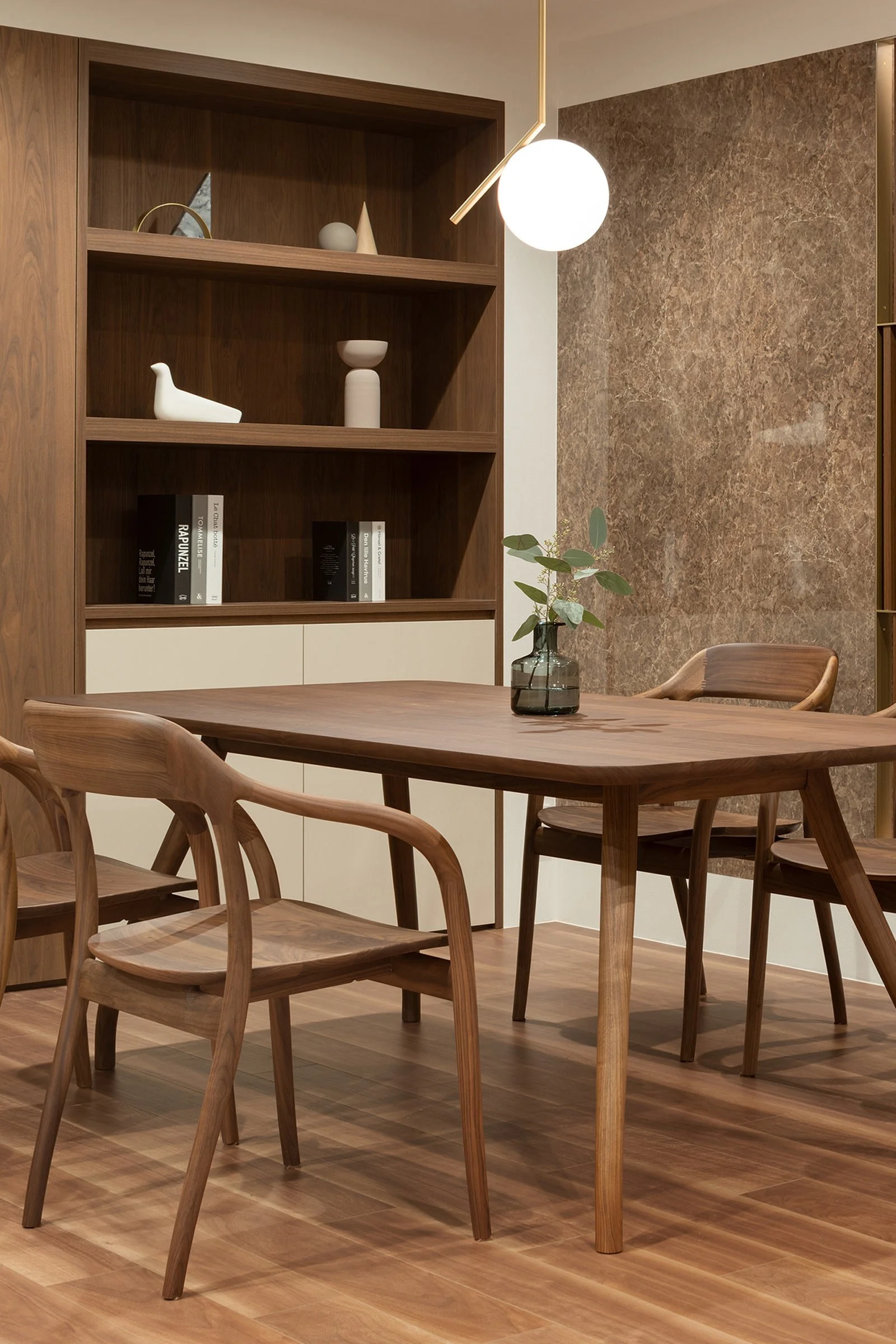
IT: We intentionally didn't incorporate any particular references into the space. At just over 80 square metres, the apartment is quite small and so we didn’t want to lose our originality by using references that might have too much influence. Initially, the words ‘luxury’ and ‘dignity’ were used a lot, but through discussion we realised that this was only what worked for the couple, not necessarily for their child. We thus came to the conclusion that we should aim for a coexistence of lightness, luxury and mass.
Please tell us a little about the material choices for the space.
IT: The choice of materials was very important to balance the different desired aspects of the interior. We chose walnut as the base colour and incorporated white materials to bring lightness, stone elements to bring a sense of mass, and greige hues to connect the two.
Which of the pieces in the home did you custom design?
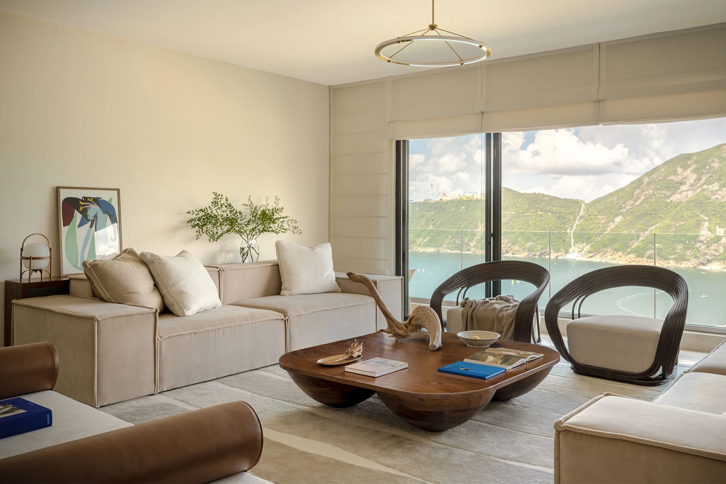
JT: We custom designed the pair of coffee tables in the living room. They express the coexistence of lightness and opulence by being light in shape and solid in material.
Do you have a favourite element or design detail in the interiors?
JT: The niche carved into the storage space behind the sofa, which is lined in walnut. Without this small interspace, the continuity would be completely different.
Images / Takumi Ota